1/16
When a house-hunting hobby pays off
PHOTOGRAPHY: ADAM KANE MACCHIA
WRITTEN BY: DAN MAZZARINI
I joke sometimes that Andy and I need a less expensive hobby - being partnered to a guy in real estate means that you spend your weekends visiting Open Houses, and that your vacations are ripe for Zillow searches. It's also a skill that can sometimes pay off in a great way, which is how we found our Greenwich Village apartment.
It was pre-pandemic, and our rental apartment was coming up for renewal. I - being my Mother’s child - was convinced that we could pound the pavement and find a less expensive apartment. Andy played along, and so we walked half way down our block on 9th Street. We approached our first building, where a smiling doorman greeted us.
“Do you have any rental apartments?” I asked.
“No, we don’t rent.”
“Well do you have anything for sale?,” Andy joked.
“Well, uh, not yet but yes we will. Someone just left the ninth floor.”
Holy When Harry Met Sally - could that really be how we found our apartment? In a word, yes.
The doorman told us we could see the apartment, gave us the keys, and sent us up! When the elevator reached the top floor and we opened the door, we walked into what would become our pre-war apartment. Lots of original everything - floors, doors, lights, and a working wood burning fireplace. Sounds glamorous, but the entire thing was a major “before” and in desperate need of both operational and aesthetic updates. After a long series of events, our offer was accepted, and we began the renovation of our 1920’s Greenwich Village apartment.
2/16
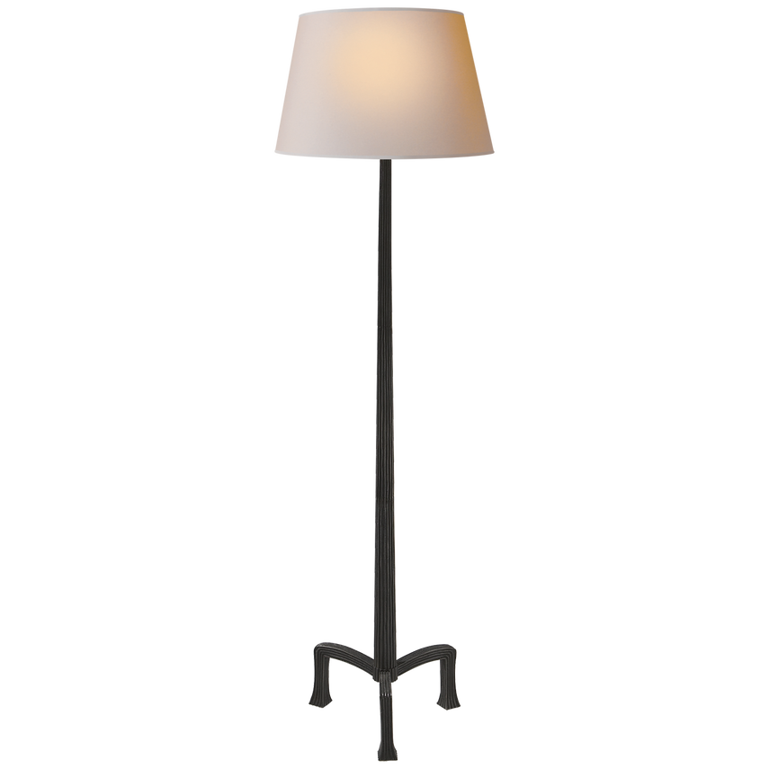
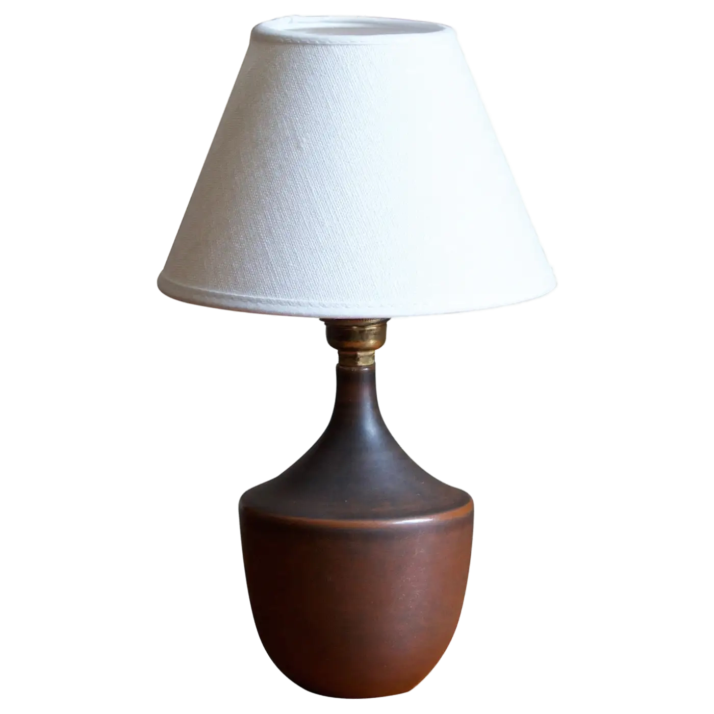
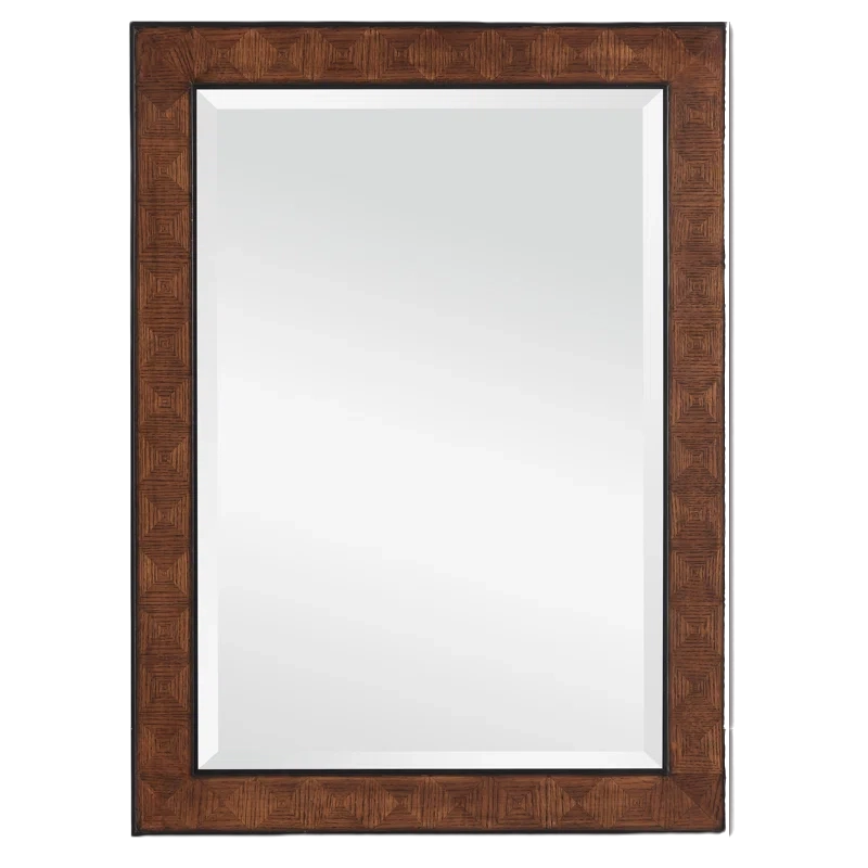
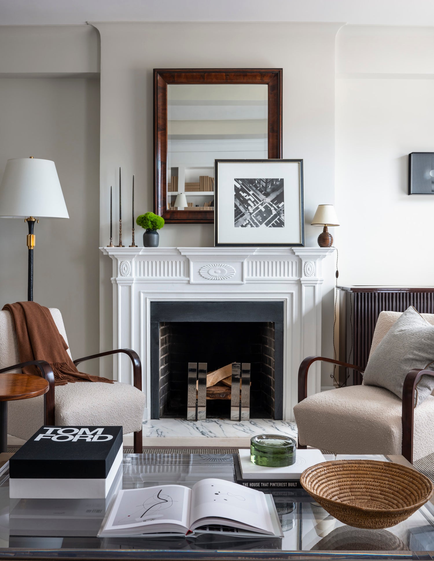
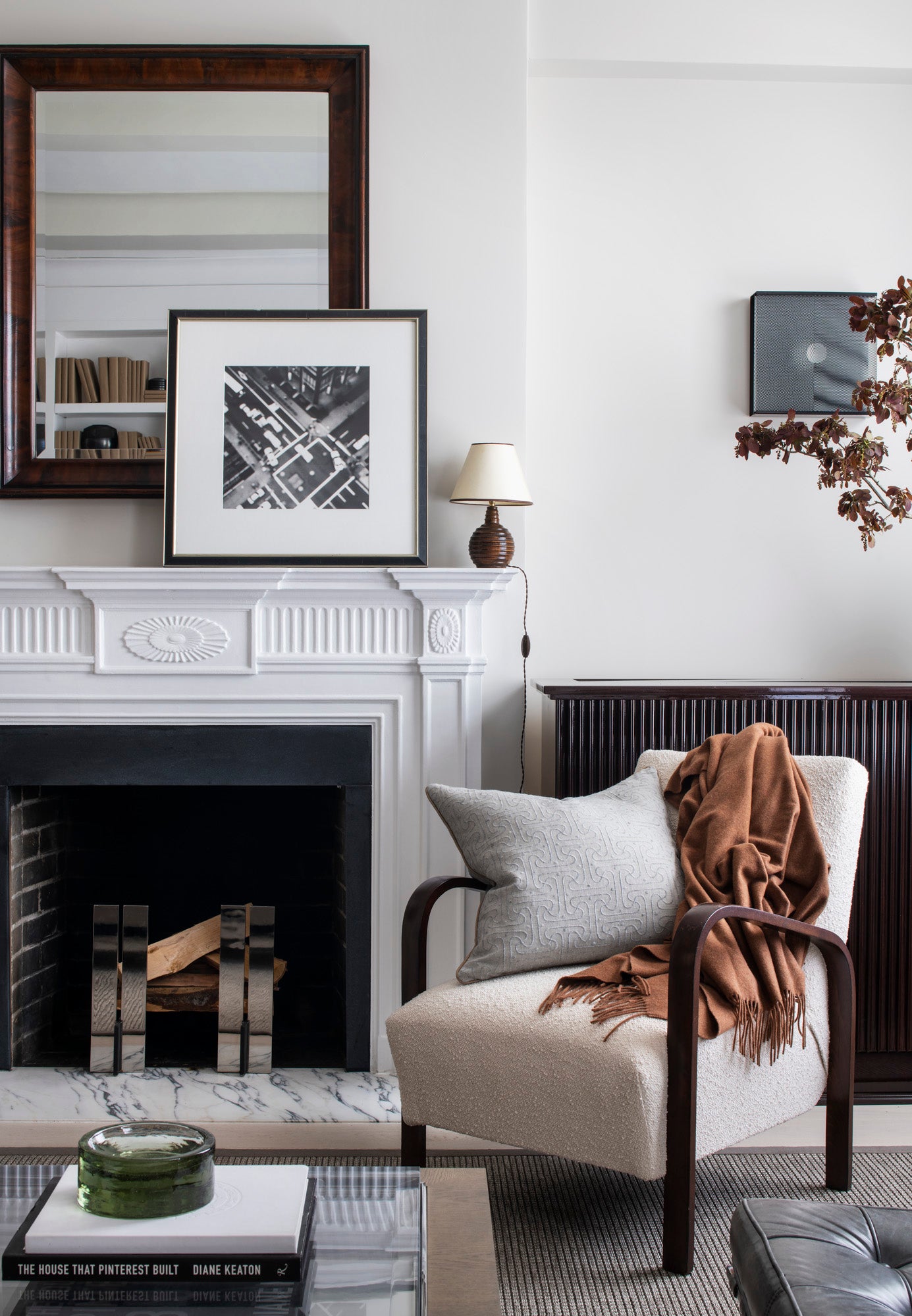
The original 100 year old mantle was updated with a new stone inset, above which I hung a mirror from the Paris Flea Market, vintage ribbed wood lamp, and art from my Ralph Lauren days. The RW Guild candlesticks were a gift from a friend, and the andirons are 1stDibs.

3/16
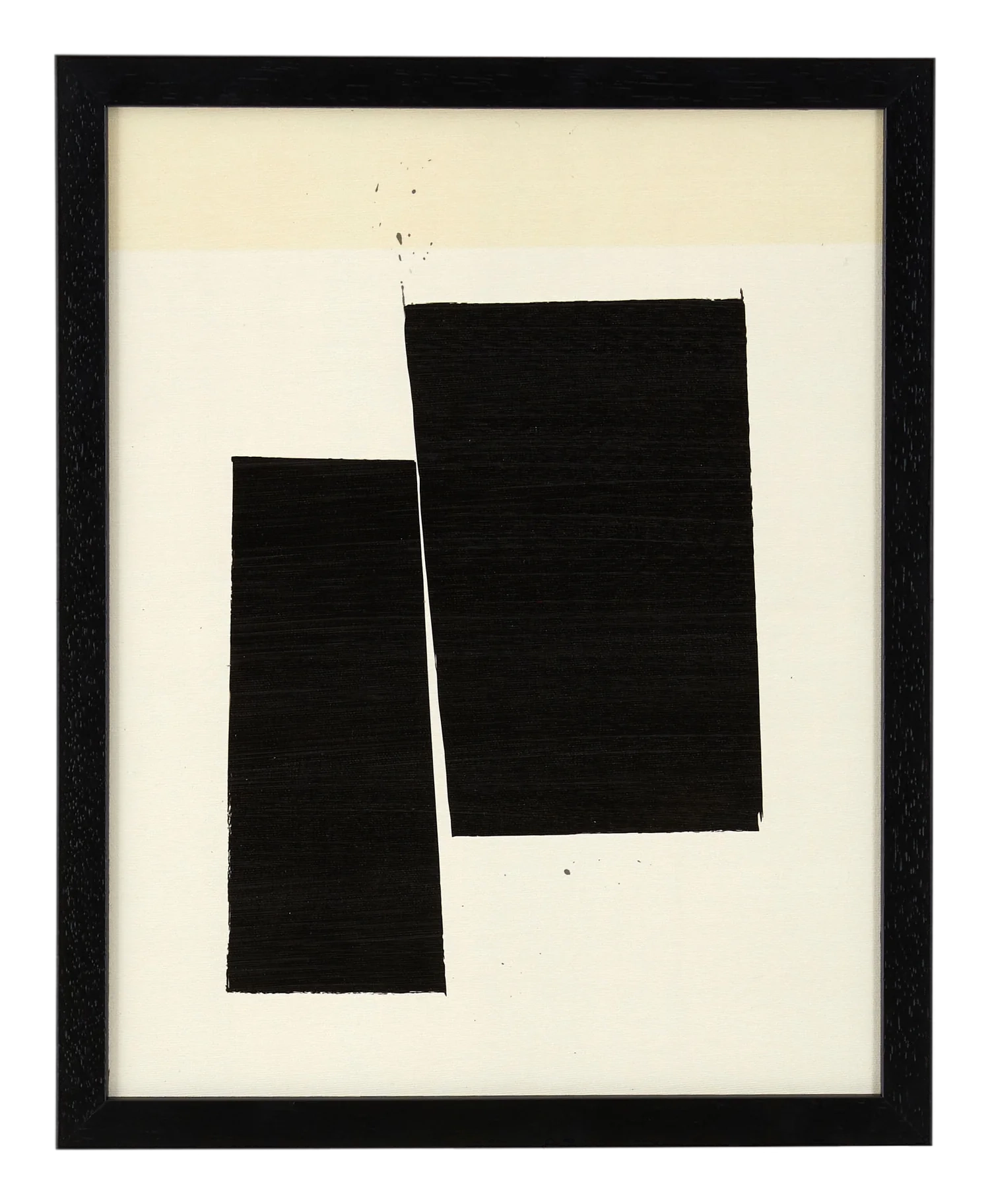
Where’s the TV? We hid it in a custom-designed mahogany cabinet to the right of the fireplace. Overhead I hung a piece of art from Marfa artist Cody Barber. The table is custom, the chairs from Chairish, and the rug is via Misha Carpet.
"Being partnered to a guy in real estate means that you spend your weekends visiting Open Houses, and that your vacations are ripe for Zillow searches."
I love an old building, and I love trying to keep original details. This apartment, however, needed a full gut. After about 50 years of disrepair, we had our work cut out for us. New plumbing, replace knob-and-tube wiring, asbestos abatement…the whole thing. If we were in it this deep, we may as well make some structural changes, too.
4/16

5/16
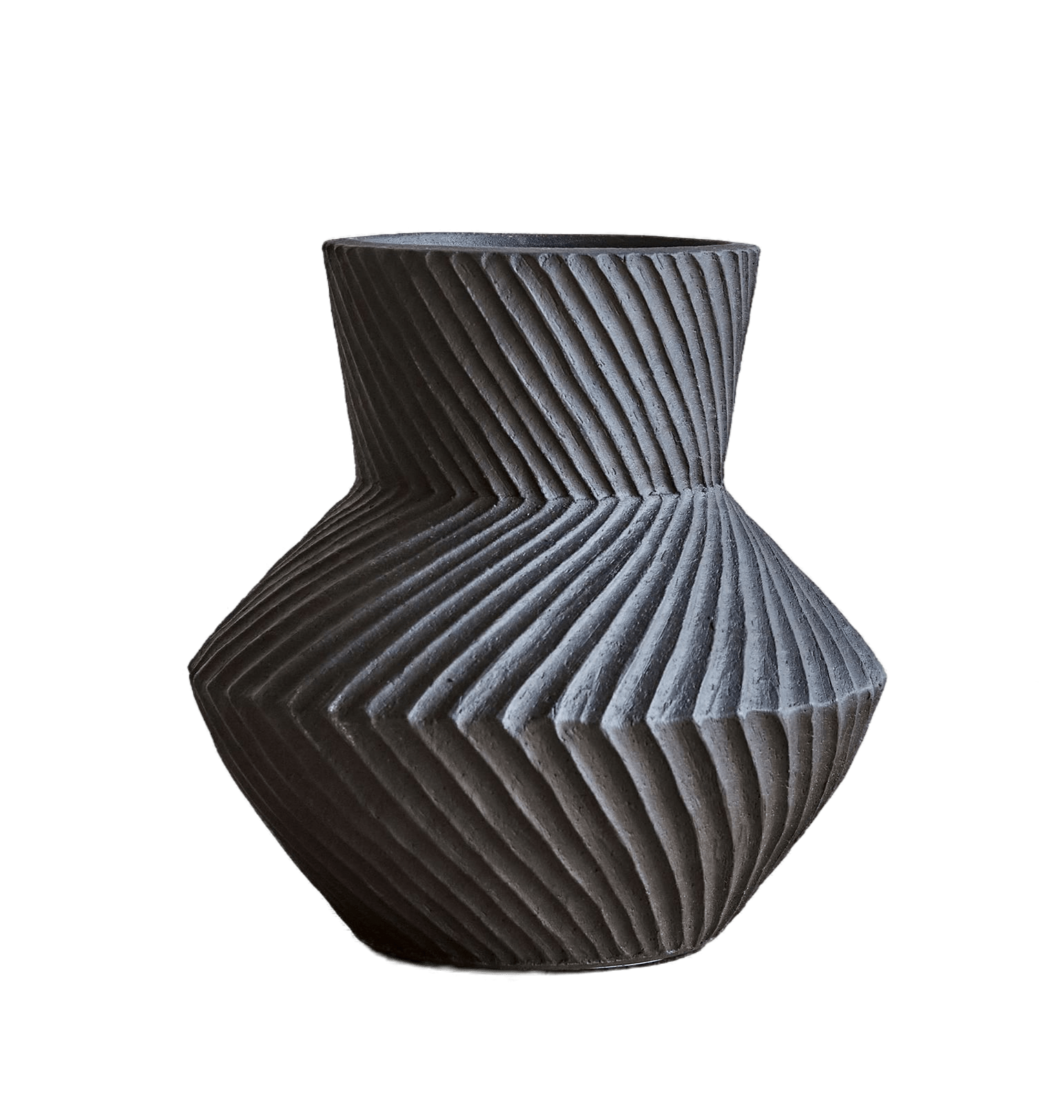
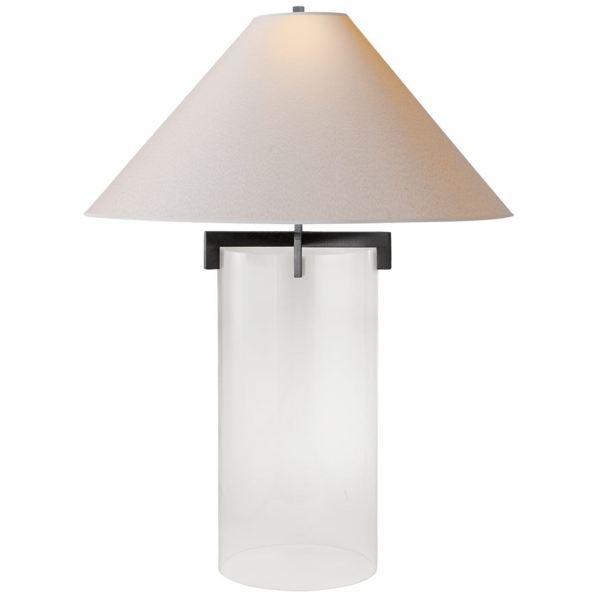
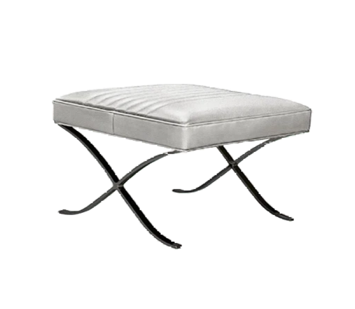
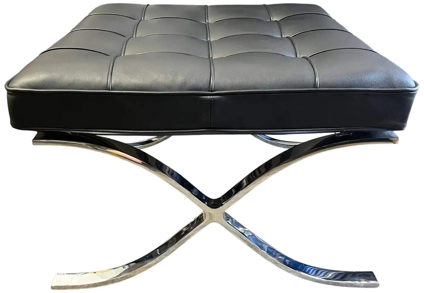
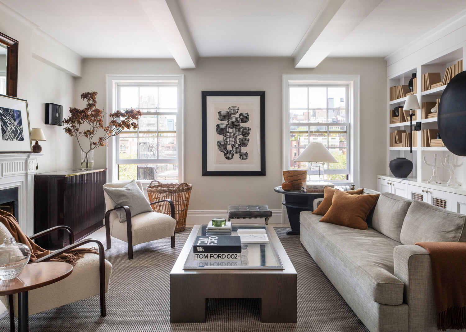
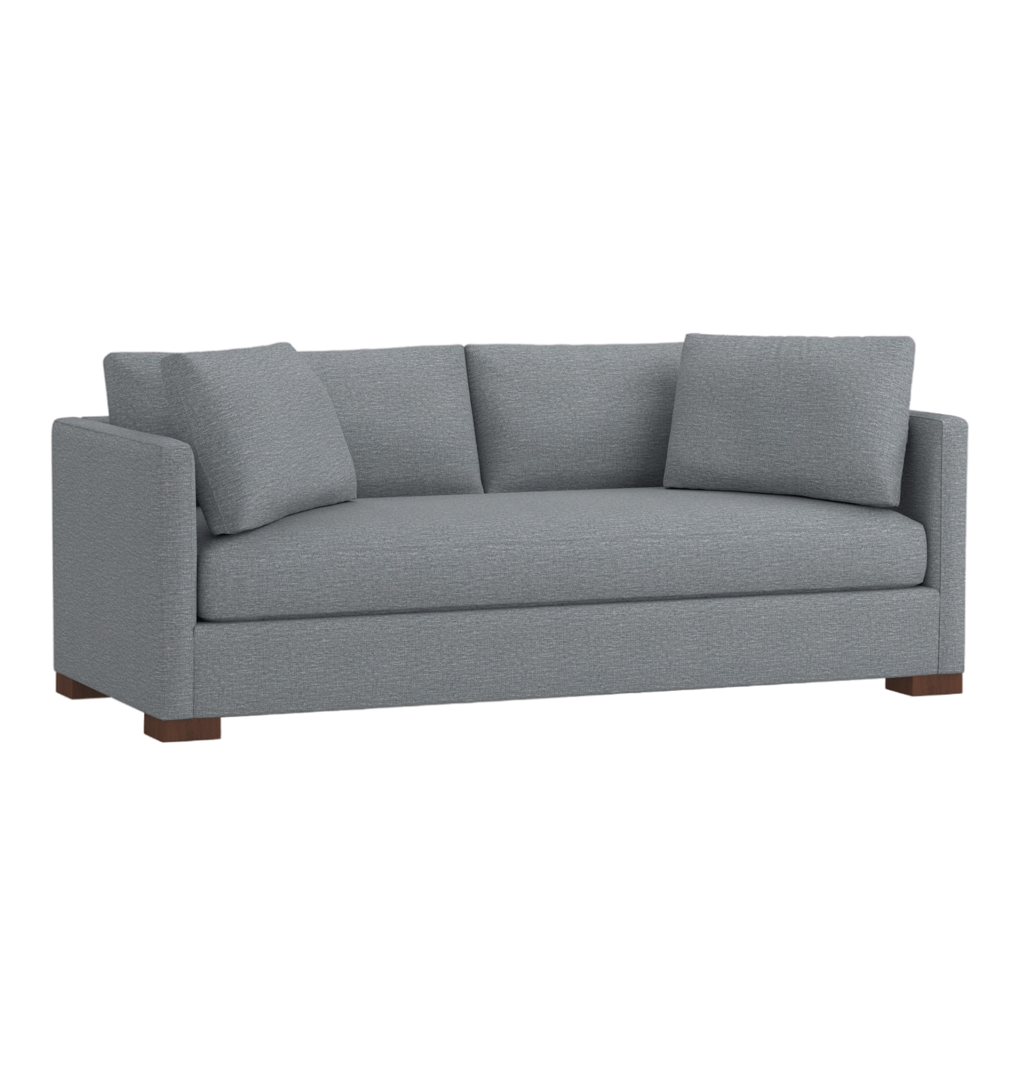
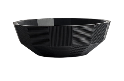
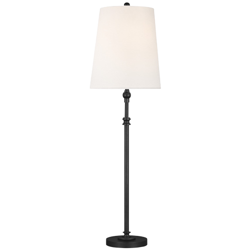
Every dog will have his day, and Merle is always super comfy on our custom sofa in Mulberry fabric. The side table was vintage from a Ralph Lauren shopping trip, and the glass lamp was from Harrods home store. The large art is by Ximao Miao, and the black pottery is my collection from the talented Andy Bissonette. Oh - and the Barcelona ottoman was found on the sidewalk on the Upper East Side. (Don’t worry - I reupholstered it long ago.)
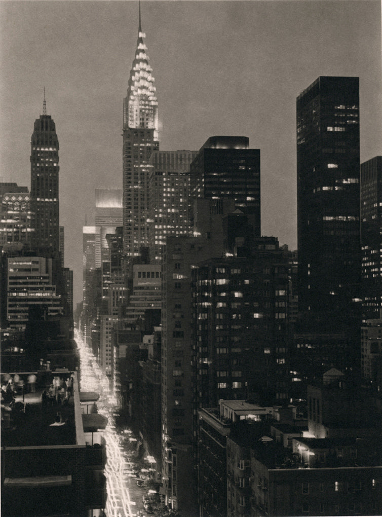
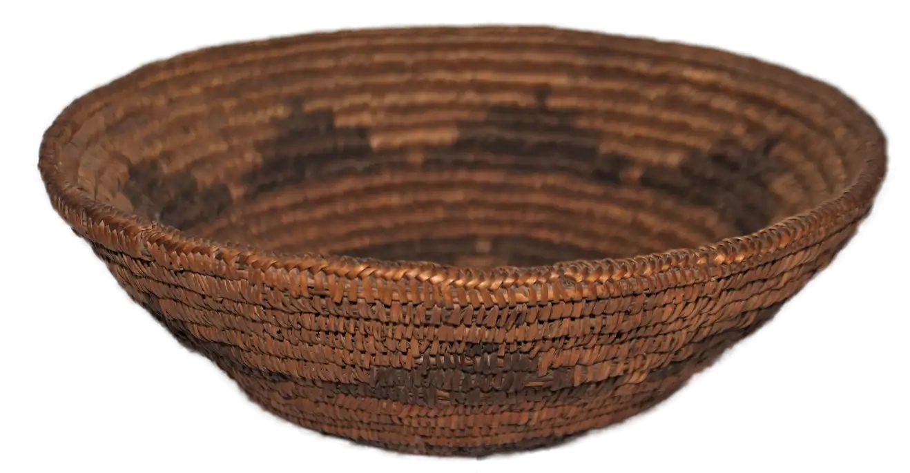
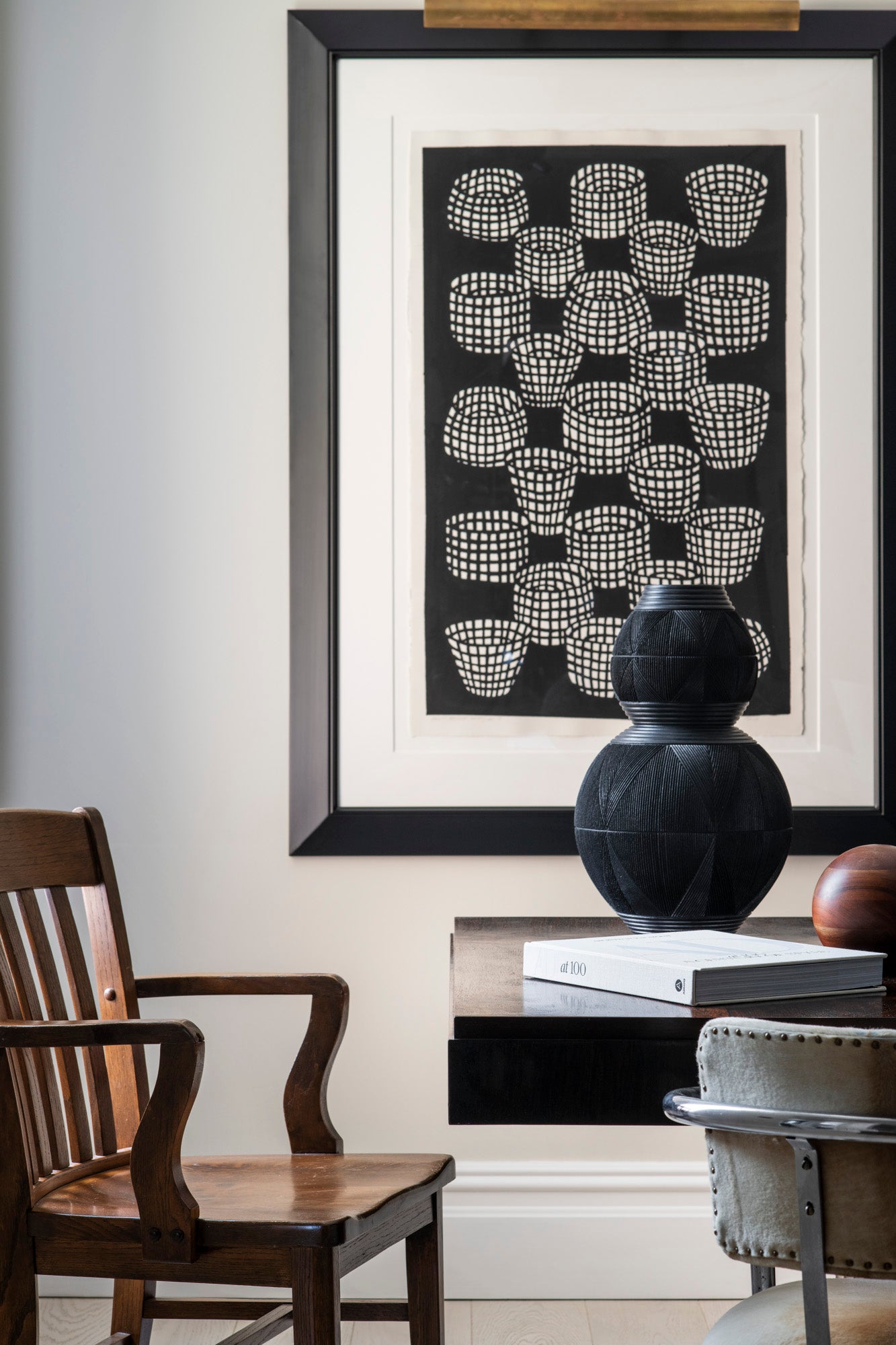
Our North-facing view gets surprisingly nice light, but the star of the show is the Empire State Building. All the trim details were designed to match the character of the 1920’s building. The basket art is by a long-time friend, Chicago-based Michael McGuire.
The apartment had great north, south and east facing windows - in 20 years of being a New Yorker I had never had “a view” from my apartment. This space has unobstructed views of the Empire State building, so we wanted to see it from as many rooms as possible. Two guys didn’t need two bedrooms, so we removed a wall and realigned closets to make a more gracious living space instead.
Original doors that had done their duty were replaced with new three panel doors, and painted a high gloss black. Trim and millwork was thoughtfully added to match the character of the building. The original fireplace mantle and cove ceiling details remain, as the only meaningful reuse of the prior space.
Furniture was a mix of old and new - the sofa from my 13th Street apartment got liposuction, and a new lease on life thanks to a reshape and reupholstery. Chairs from Chairish were perfect and breathy in a white bouclé, and I revamped a custom cocktail table I designed for the Michael Kors Rodeo Drive store 18 years ago (look for it in our Archive furniture line, soon!). Our existing lighting and art was complemented by new finds, and underfoot an indoor-outdoor with a custom binding became man’s best friend (when we got Merle.)
7/16
The chair in this sweet tableau was Andy’s grandfather’s - call me old fashioned, but I love pieces with a story.
8/16
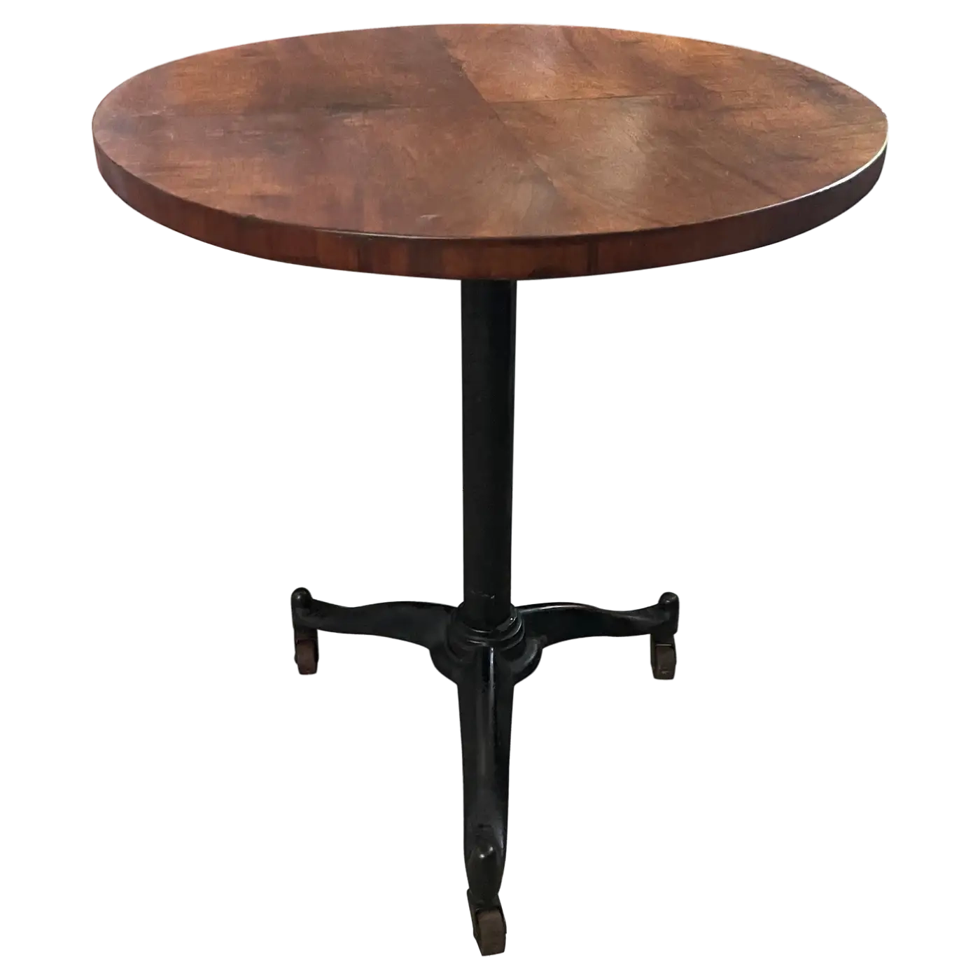
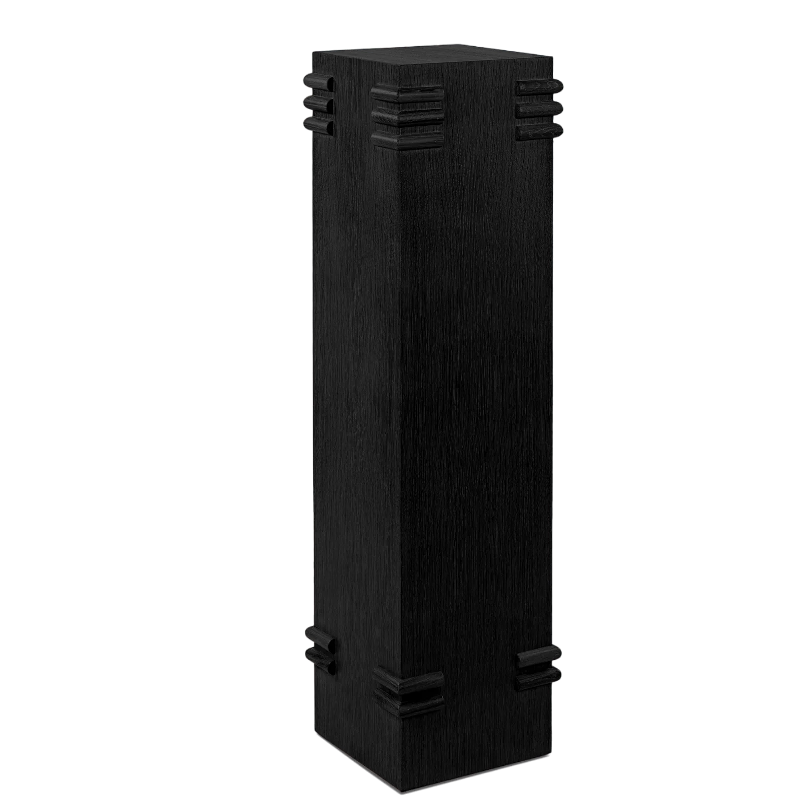
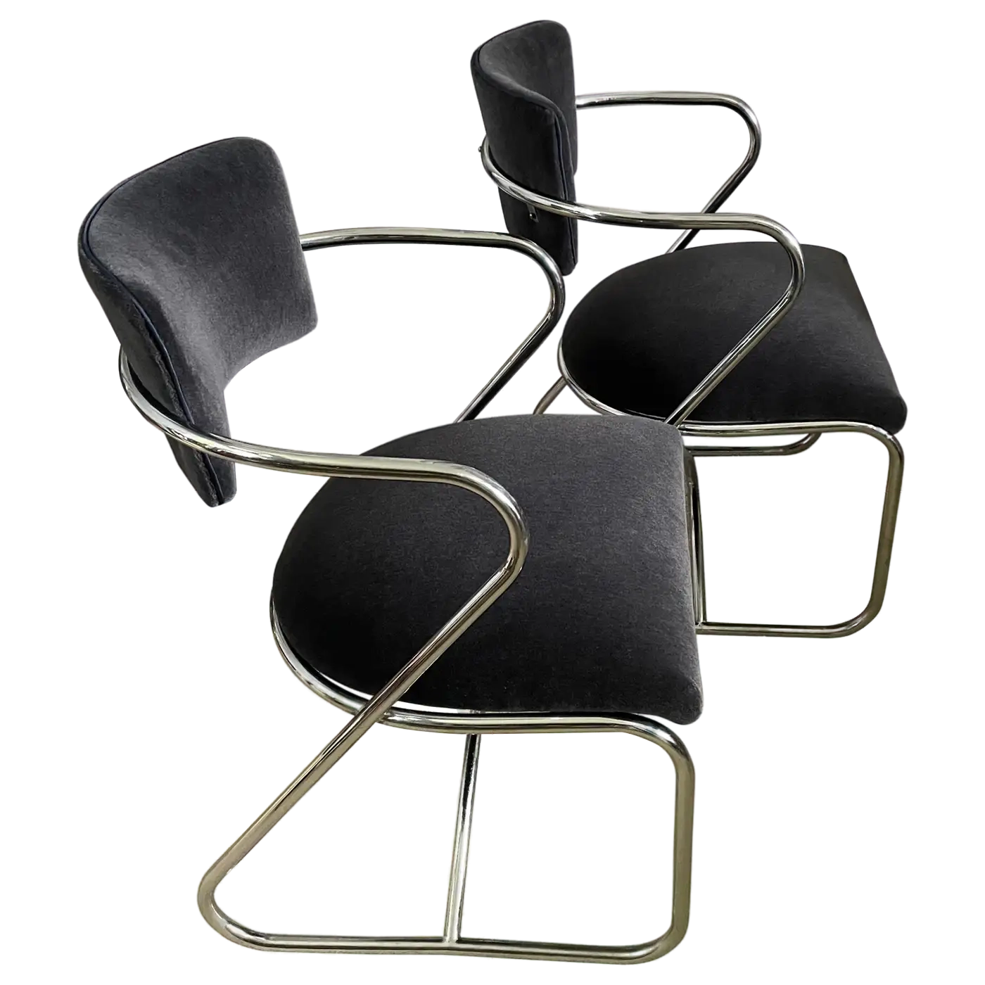
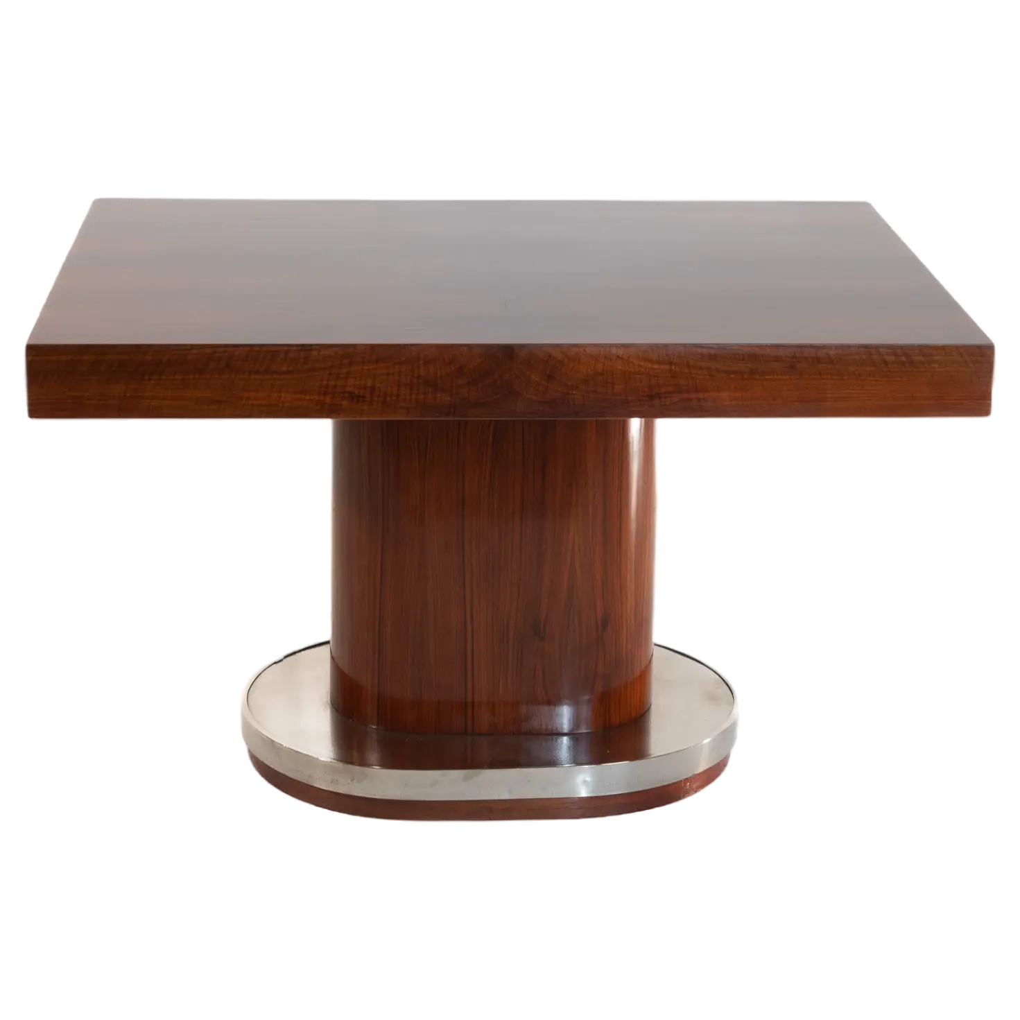
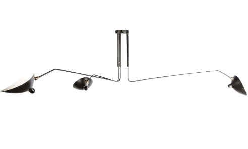
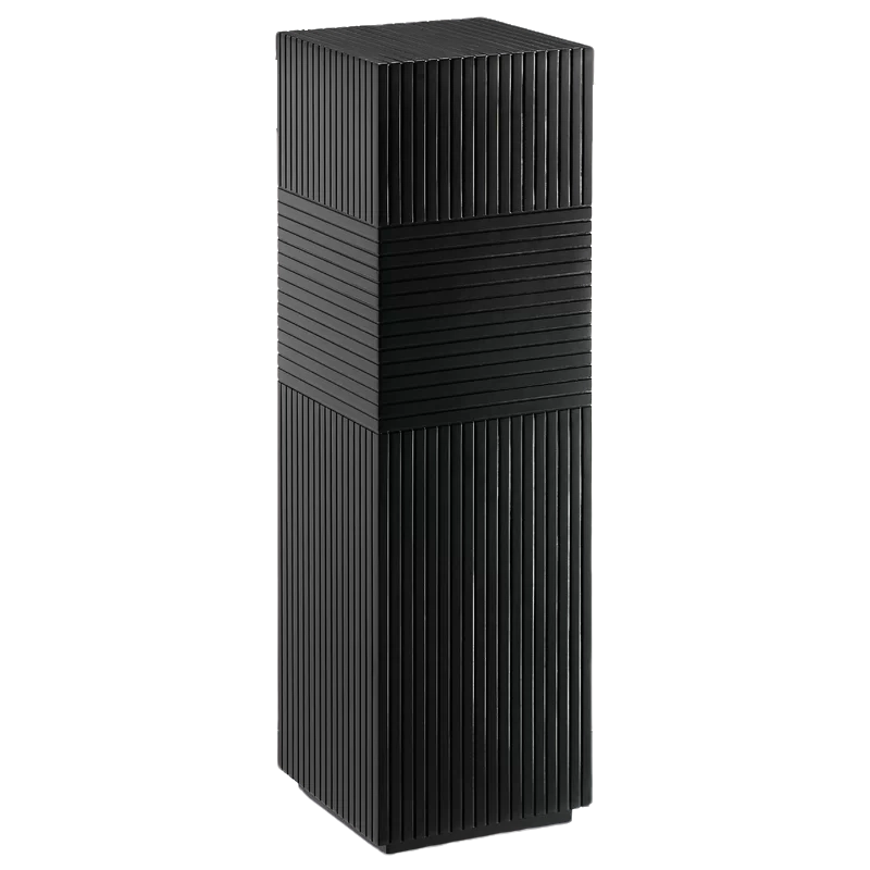
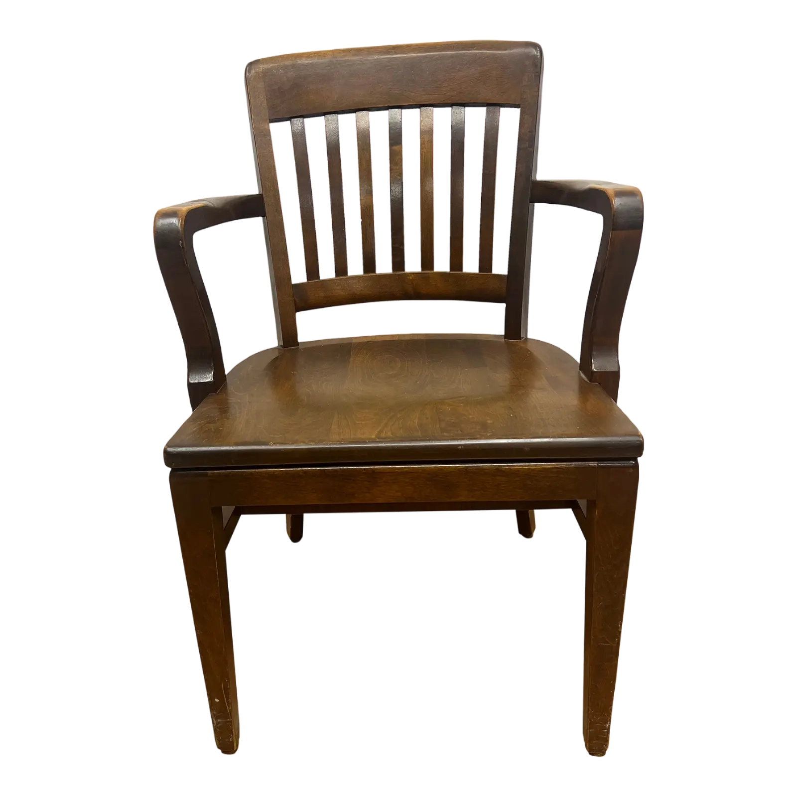
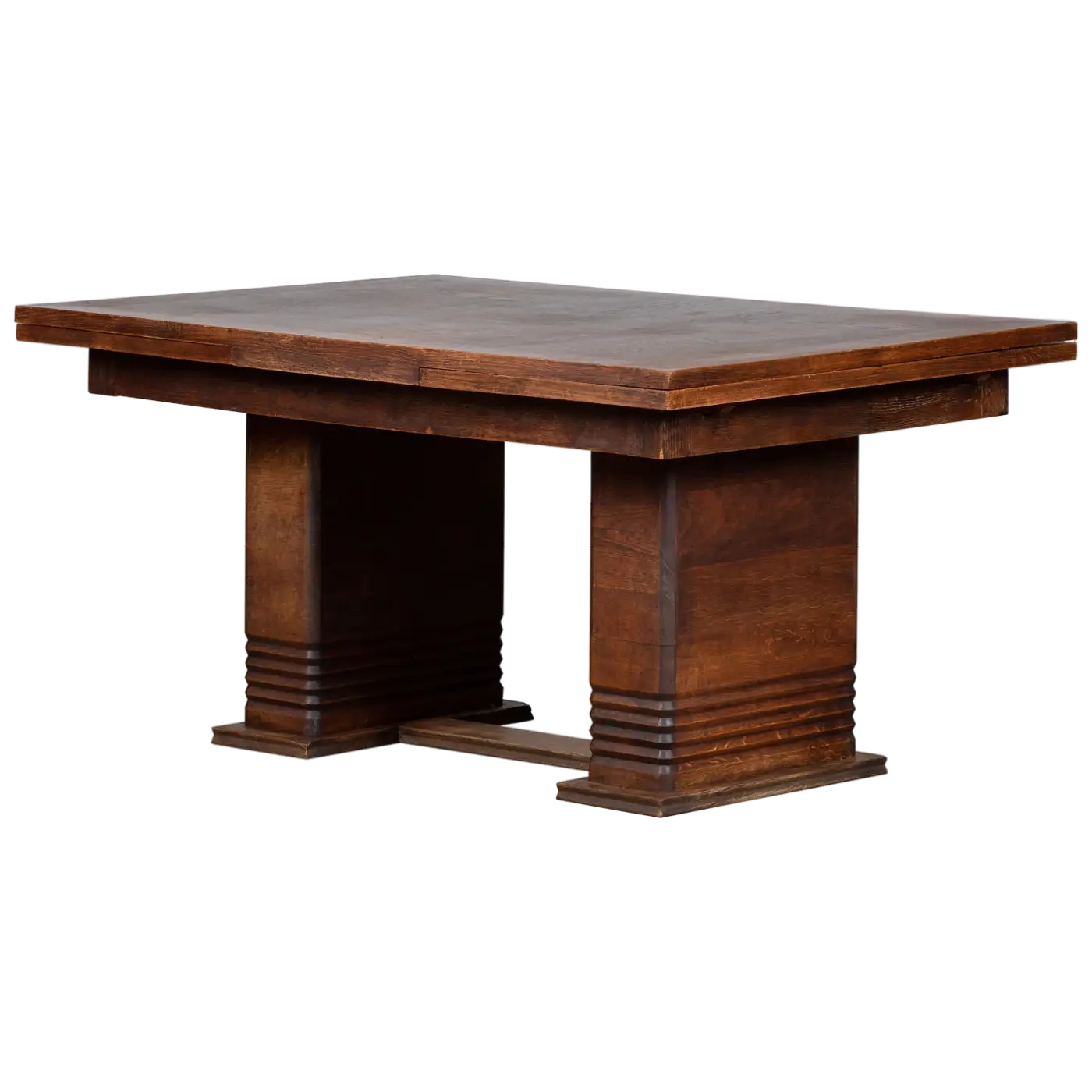
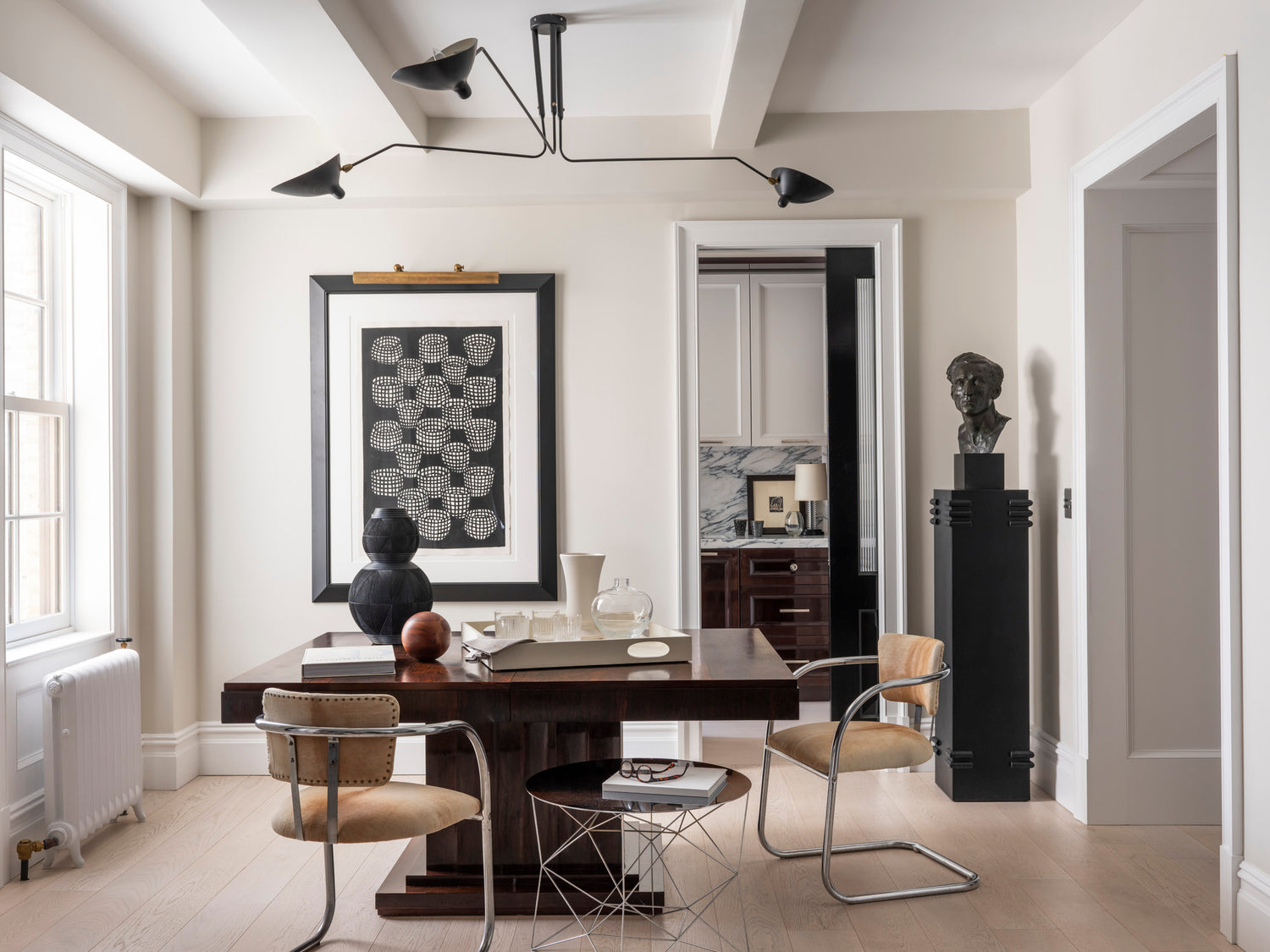
Simple, clean, and easy - our little dining space is signature DJM, with Mouille-inspired light overhead, and antique French deco dining table offsetting the otherwise light and lovely space. The chairs were bought years ago on Ebay, and reupholstered in calf hide. The wire table is vintage West Elm; the column was designed by my buddy Josh Greene, and the bust was a Chairish find.
9/16

10/16
"It’s funny what moving can do - even half a block away can make a world of difference."
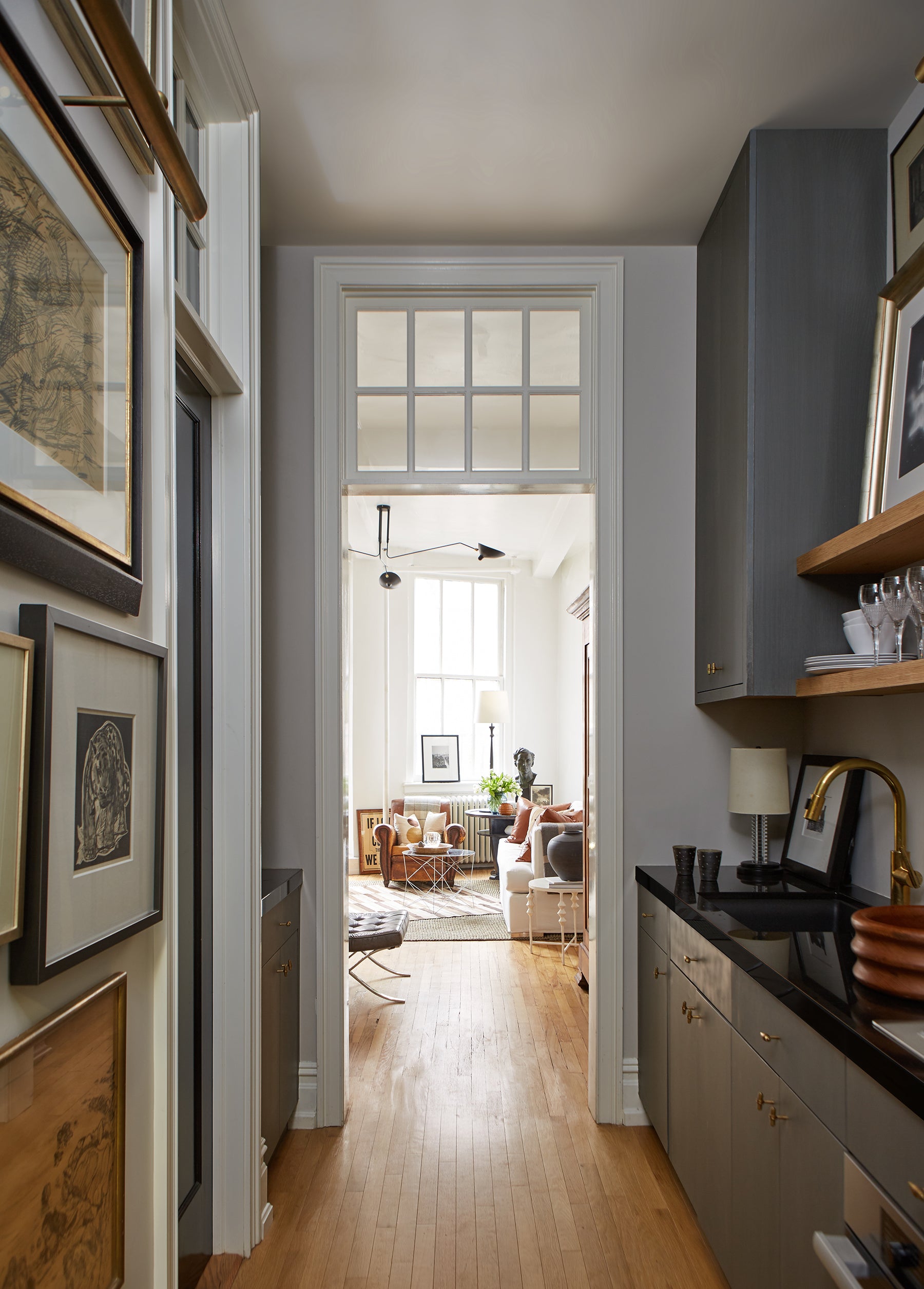
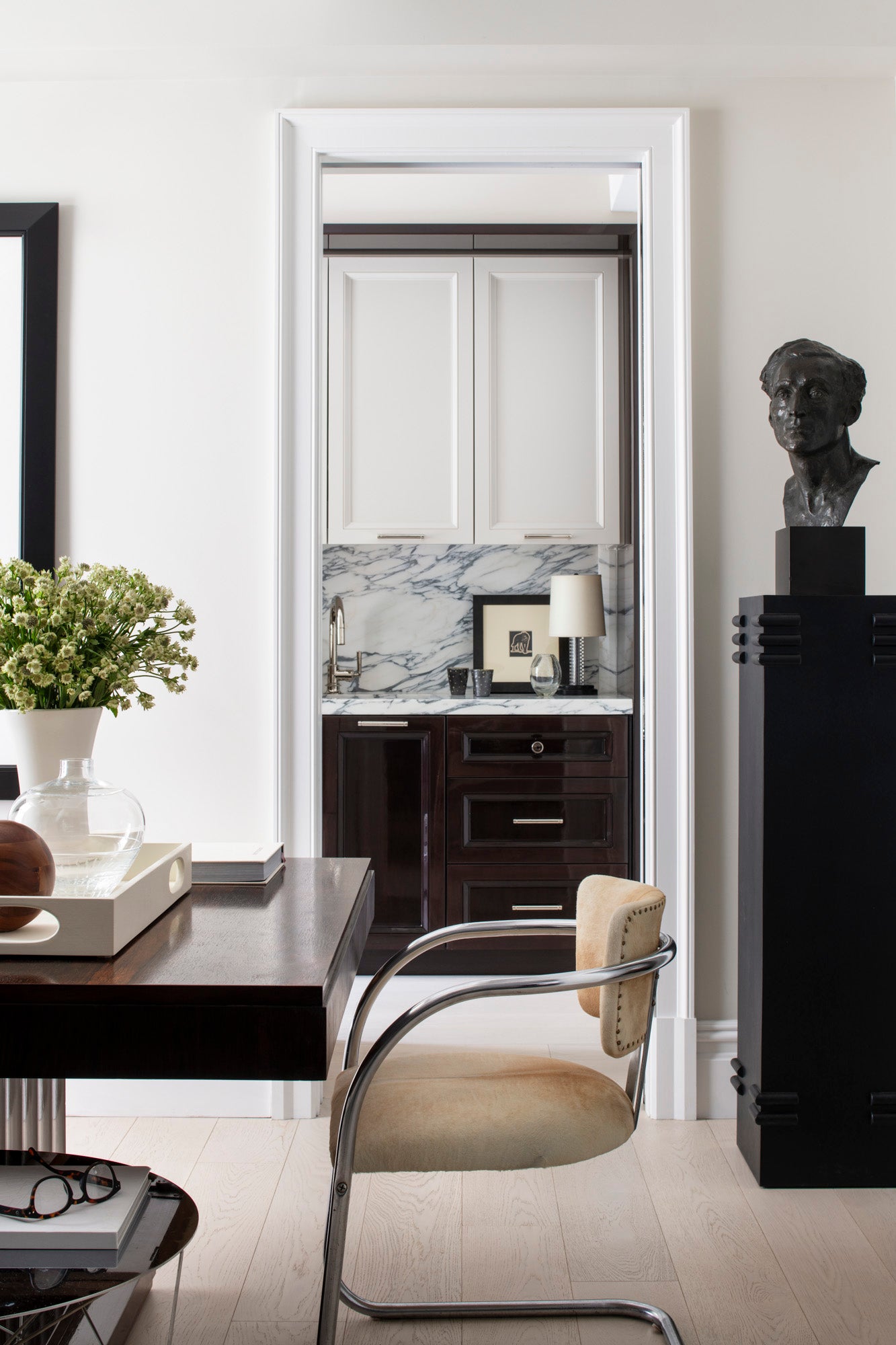
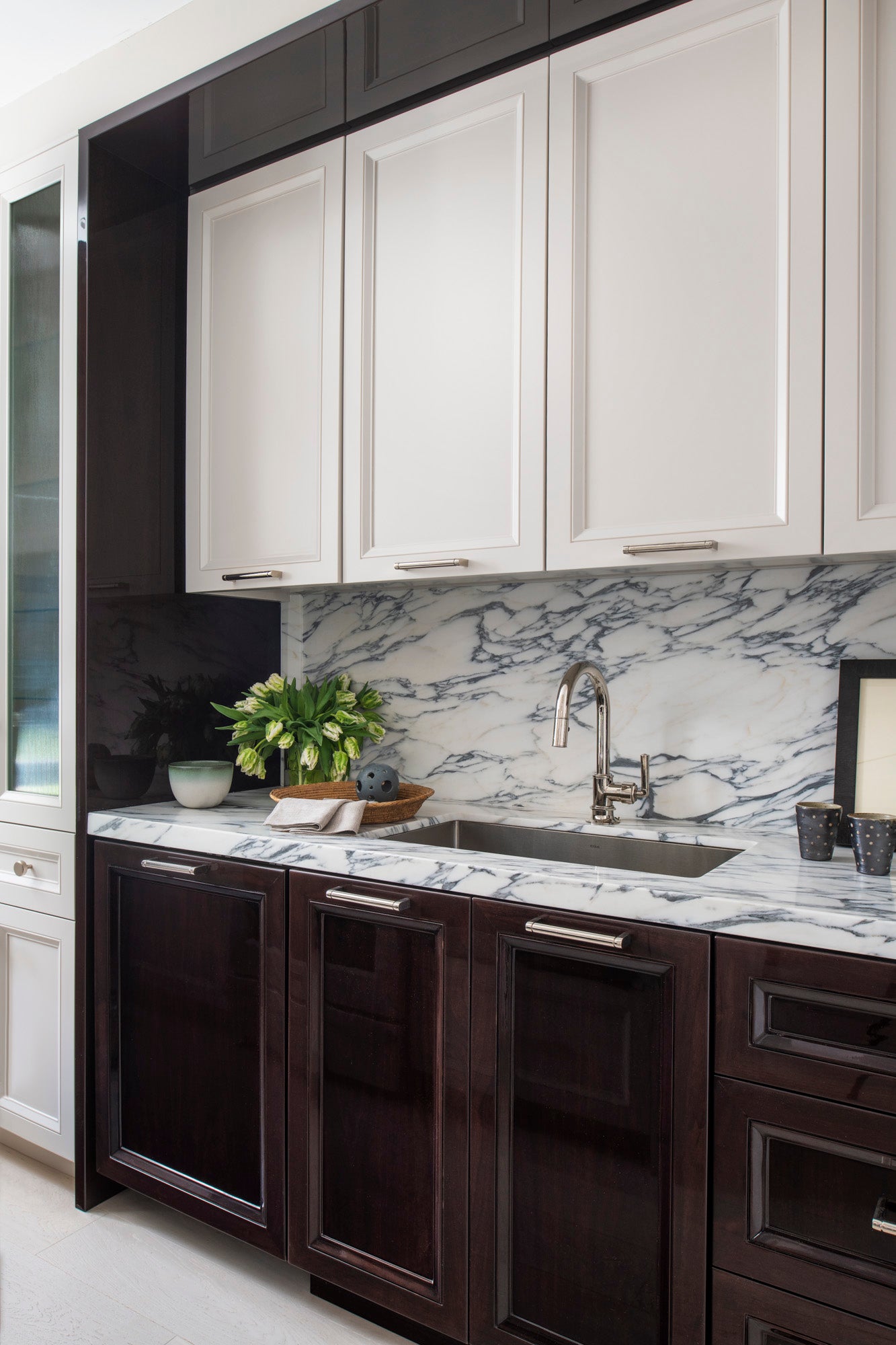
The kitchen - once cramped and an awkward scattering of old appliances, got an overhaul. I pictured this glossy sort of hotel room kitchen - something that functioned well, and looked just as great when not in use. I designed a mix of high gloss mahogany, reeded glass, and Collingwood painted cabinets, and topped them all with Arabescato marble slabs. Appliances were chosen to be clean and discrete.

11/16
I didn’t want an all white kitchen, so I mixed Collingwood painted cabinets with high gloss mahogany, reeded glass, and Arabescato marble. I also placed all my pulls horizontally - I like the visual line they make. The white Le Creuset was a house warming gift from me to Andy.
12/16
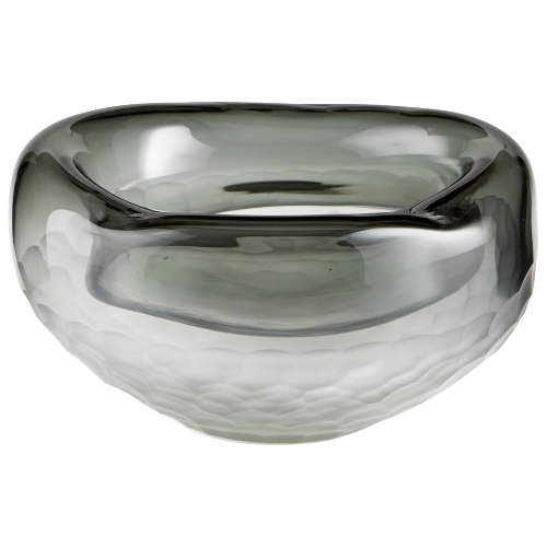
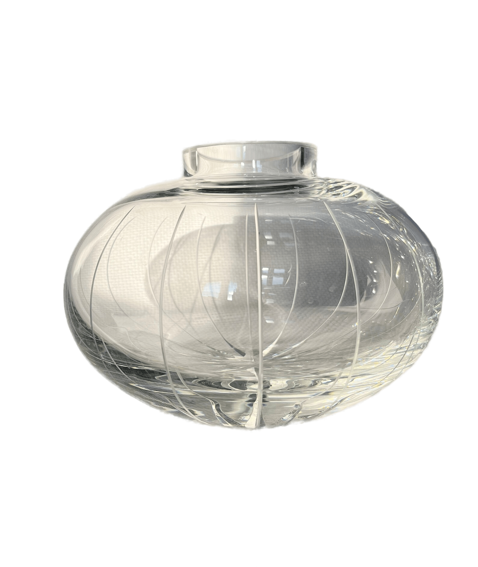
Sneak peek in the kitchen - a vintage French etching pairs with a lucite Thomas O’Brien table lamp. A pair of polka dot mugs from the Northern Clay Center sit with a bubble glass vase, a gift from a friend.
13/16
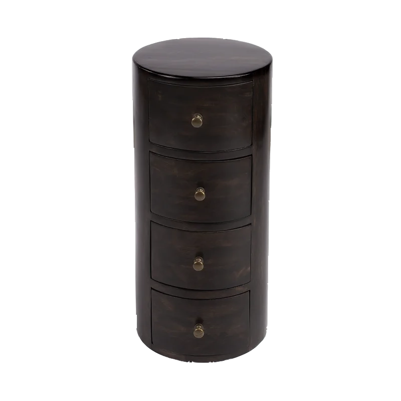
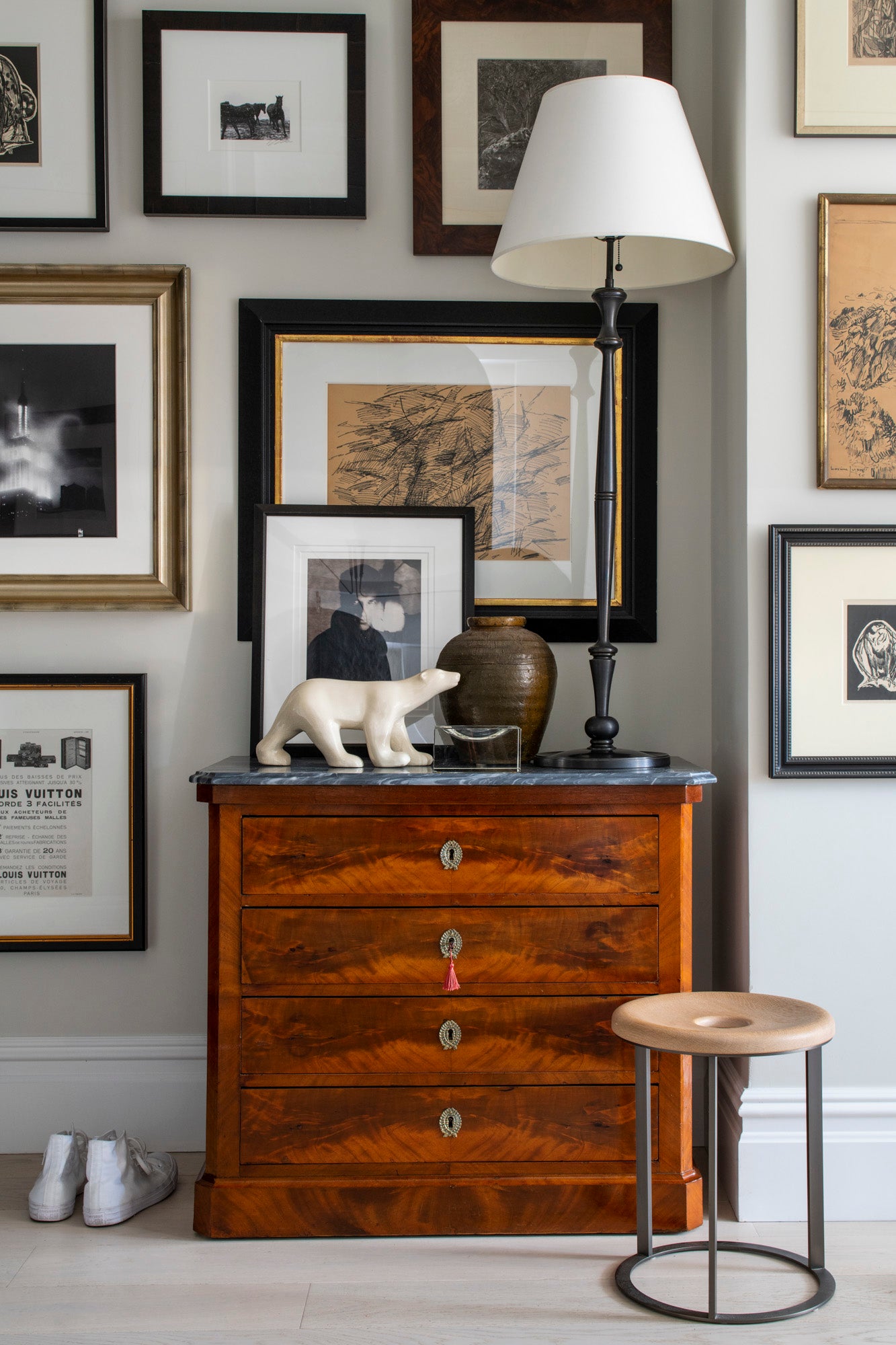
Our front entry represents a blend of old and new - the art is a mix of mine and Andy’s, much of which has lived in our apartments through the years. The Lamp was a purchase from Aero’s Broome Street store, and the chest of drawers was bought on Chairish for this spot. The little stool we bought at a resale shop in San Francisco, and the Polar Bear was a gift from my Mom on a trip to Paris - ooh la la.

14/16
Our little bathroom got a facelift - while we wanted to make it bigger, code and existing conditions kept us from doing so. It remains the original footprint, with new 6” Waterworks tile and a plaid mini-mosaic floor. In the bedroom, we needed more storage, so I designed a his-and-his matching millwork cabinets, which now flank our version of a Carrie Bradshaw desk - the best seat in the house to work and watch the city go by.

15/16
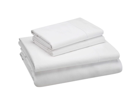
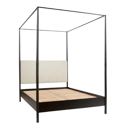
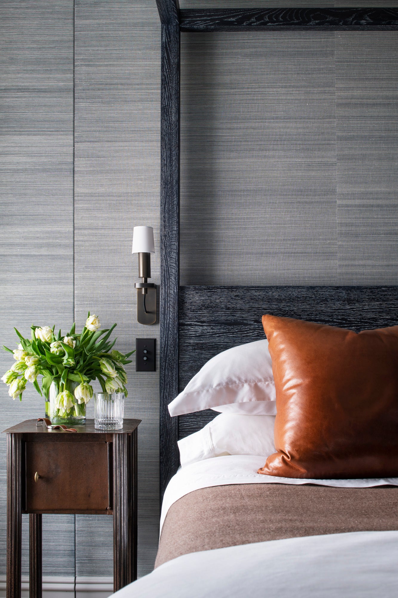
An over-scaled poster bed may not seem like a logical idea, but I like the scale and architecture it adds to the tiny bedroom. Linens are Williams Sonoma and Walmart (believe it or not) - they are these great thick cotton sheets we love.
16/16
Innovations grasscloth is a quiet texture for the bed. I bought this little but extra-tall table at Beall and Bell in Greenport, NY. Leather pillows are from my last apartment, a signature move.
When it came time to decorate, we realized that we wanted something quiet. Life is gratefully so busy with travel and both of our businesses, so it was important that home feel like a respite. I chose a palette that was light and bright, but shockingly not straight up black and white. Floors are in a pre-finished white stain, walls were painted Intense White (which is really a warm gray,) and trim in Chantilly Lace. In the bedroom walls were papered in an Innovations grasscloth that I had used and loved at a client’s home.
It’s funny what moving can do - even half a block away can make a world of difference. We love our apartment and building, and life here is quiet most of the time. In making changes - not just in locale, but in how we live, and what our apartment looks like - we made sure that our apartment worked for us, and the next story we want to share with the world. Maybe it turns out that our hobby isn’t such a bad one after all. Certainly worth the half a block walk to see what’s out there.
